
New look, same great Dropmark
Today we are launching a brand new look for Dropmark. Still the same great app you use across web, Mac, and iOS, but with a more human focus.
Dropmark allows you to collect, organize, and discuss anything online. To us, this means any skill, any interest, any individual, and any team can use Dropmark. We wanted to make that clear in our redesign.
Whether you’re gathering inspiration, sharing designs with clients, or collaborating with your team; Dropmark is a tool that will help you get stuff done. But crucially, the hard work is done by our users, Dropmark is just the platform. We wanted to put our users in the picture.

Dropmark has a diverse user base — from Norwegian graphic designers to global book editors. Our goal was to represent our users while communicating a clear design direction. People upload their whole workflow to Dropmark. Everything from napkin sketches to After Effects renders — and of course GIFs. Making it clear that Dropmark is a place for all these different elements was an exciting challenge.
We began by thinking about the range of content uploaded to Dropmark as building blocks. Seeing images, maps, videos, and links all in one place on the screen; in contrast to bookmarks and scraps of paper in the physical world. These elements evolved to create an illustrated three-dimensional paper folded universe. A place where people are inspired to build, collaborate, and grow.
Collaboration and privacy are at the very core of Dropmark’s mission, so the new imagery shows users interacting with Dropmark alone and with their team. Our new site also highlights more of the real teams using Dropmark at companies across the globe.
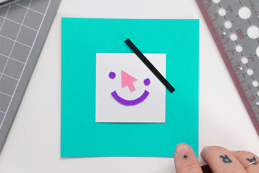
Photo: Meg Lewis
You’ll also notice a change in our typeface. As Dropmark continues to grow internationally, we want to support more languages. In the development of our iOS app, we found our old font had issues rendering non-Latin characters. So, we set out to find a font that would be able to handle localization while retaining our high typographic standards.
After an exhaustive search, we found that FF Real by Erik Spiekermann was the font of our dreams. Not only a great solution in-app, it felt right to incorporate the font into our logo during the redesign. The heavier weight helped ground the logo and allowed for more visual variation. We also chose to capitalize the ‘D’ in the logo. This was important for us because we wanted to elevate our brand a little bit and shrug off the awkward teenage headgear.
Finally, we’ve tweaked the names of our pricing plans to better differentiate our offerings. Solo (previously Pro) is perfect for freelancers or anyone looking to improve their flow and work with individuals. Teams are designed with groups in mind and give you access to all the collaboration tools you could need. Enterprise is ideal for companies and can be reconfigured to perfectly fit any organization.
Visual organization is in our DNA. When approaching our redesign, it was essential for us to keep the essence of Dropmark. It’s important to us that no matter what you do, you can see that Dropmark is a place for you.
Shout-out to the whole team at Oak Studios for their hard work, and to our friends and collaborators: Kelli Anderson, Meg Lewis, Hayelin Choi, and Frank Chimero.