
Using Dropmark to design Dropmark
Dropmark is a core part of our workflow. We thought we would show you how we used Dropmark for our redesign — yes, we’re getting meta in this post.
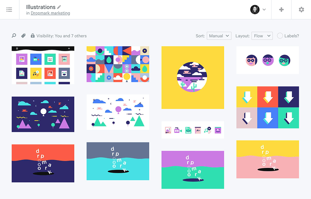
As you can see, our design collection grew over time. To keep things organized into iterations, we utilized stacks. Having one centralized group with stacks allowed us to remain focused on the project, but still have a historical record of where we’d been. If we found that we wanted to reference a particular design later down the line, we would always know where it could be found.
To start, like most design processes, we gathered inspiration like a combine harvester. Dropmark is excellent for saving inspiration and generating effortless mood boards. In fact, with a whole group of people uploading to one centralized place we got a great head start on defining elements that we wanted to explore further.
We knew we were invested in exploring an illustration style that was characterized by flat, clean lines, and color blocking. We were also drawn to illustrations which were textural, rough around the edges, and playful without becoming babyish. We love Swiss-style black and white typography and wanted to explore type-on-a-path, letterspacing, and text overlays.
Once these had been defined, we got started in earnest with experiments like this video by Hayelin Choi.
We wanted to try to convey the many ways that people use Dropmark. Students, teachers, designers, marketers, parents, and PR specialists all use Dropmark & it’s essential for us that everyone feels welcome.
We were interested in changing up the color palette after this experiment and felt that the textural nature of this video was awesome, but didn’t fit into Dropmark’s aesthetic.

For the next iteration, we dialed back on the textural elements while retaining the rough around the edges look. We were excited by the use of negative space here. The new direction also treated Dropmark less like a scrapbook, and more like a museum.
We wanted to explore that more thoroughly and found that the parameters of a museum or art gallery felt applicable to how people use Dropmark in a visual sense. We also started to hone our messaging, describing Dropmark as a place for organizing, collaborating, and discussing anything.
We were initially excited by thinking about Dropmark as a museum, but after further exploration, we realized it might not be the best fit. Dropmark is a living, breathing resource for your team. And it’s accessible. We want you to interact with the stuff on your screen: drag them, drop them, delete them. They’re your items, not ours.
In the end, we realized that not all that many people go into art galleries and take stuff off the walls, so we needed to go back to the drawing board. Instead, we explored something that people do go into and touch things on the shelves: libraries.
By this point, we were about 80% happy with the illustration style, 90% happy with the color, and 99% happy with the typography. We knew though that the last 20% would make all the difference. So, we reached out to the awesome Meg Lewis to help zap our brains with some creative juice.
Our user base is quite diverse, and we didn’t want to come off too design-elitist, but still be aspirational. Minimalism (with a touch of joy) was our North star to aim for where design enthusiasts and non-designers can feel comfortable and seen. “Less but better” as our hero Dieter Rams says.
After working with Meg to define more of the illustrative style and color palette, we began working with Frank Chimero. Frank worked with us to hone the direction of the site, including the paper fold universe you see on our site now.
Sharing those wireframes in Dropmark meant we were able to generate feedback and quickly gain a consensus.
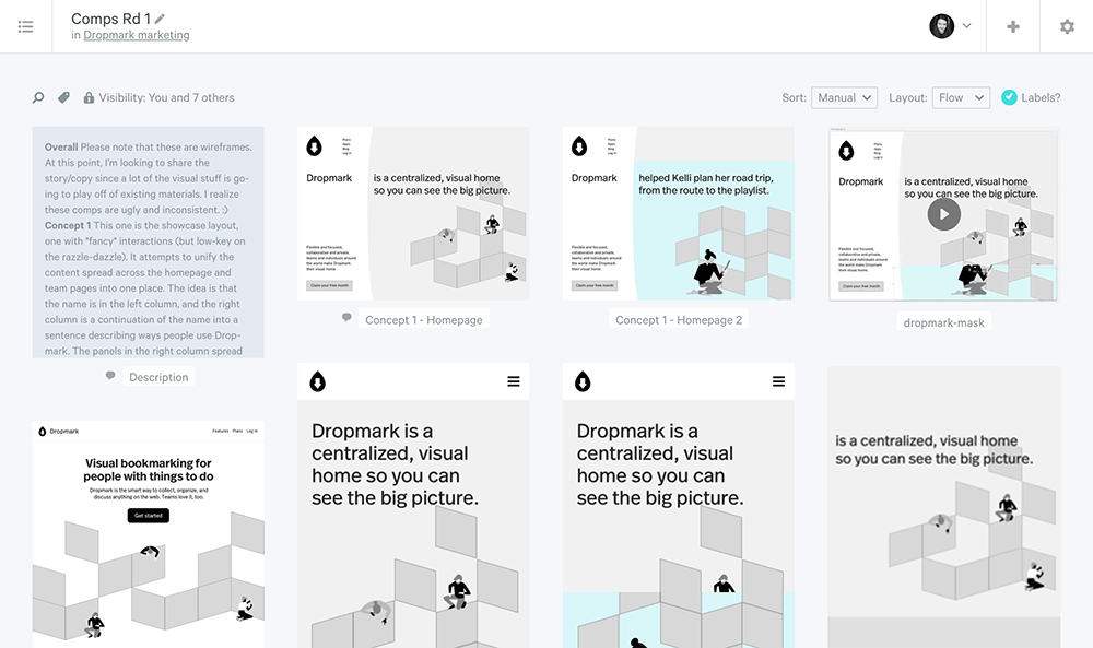
You’ll notice in this collection a text item in the top left corner. Frank used Dropmark’s text tool to set expectations and rationale out for the team in the stack. This meant that everyone had clear expectations before viewing through the stack as a whole.
We don’t sing the praises of Dropmark’s text feature enough. It can be invaluable as a way of sharing information with your team or a wider audience. It even works using Markdown if that floats your boat. Markdown is a super simple HTML format which generates text attributes using symbols you already use all the time. For example, to make a word bold, you’d surround it with two asterisks either side. Simple and effective.
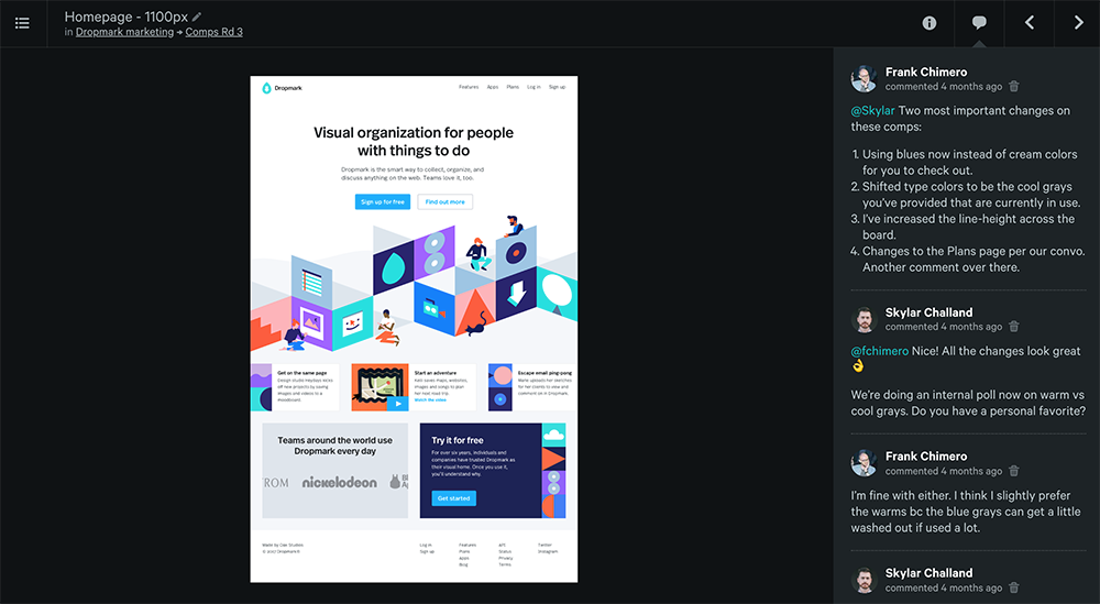
After the wireframes and full-fledged designs, we got down and dirty with the code. When we had the site in a place on a staging server for QA testing, we were able to utilize Dropmark once more.
As we were refining, we used Dropmark’s browser extension to take full-page shots of the staging site and see if there needed to be tweaked.
Annotations and comments in Dropmark make getting into the details like this so much easier than running emails back and forth. Everyone can see your thoughts in realtime and from months ago without having to search through Slack or have back and forth in meetings.

And, that’s how we did it! Let us know your thoughts on our process, design, or product on Twitter or Instagram.