Reverse Engineered - RSPCA
Have you ever seen a brand and thought, ‘I wish I could create something like that’? Us too! That’s why we’re peeling back the layers of our favorite brands to uncover what makes them stand out and using Dropmark to turn them into creative inspiration fuel.
The RSPCA launched a rebrand in 2024, marking a significant shift in tone from clinical and institutional to warm, clear, and emotionally intelligent. Designed by Jones Knowles Ritchie (JKR), the new identity keeps the organization’s legacy while making it more approachable for the next generation of animal lovers.
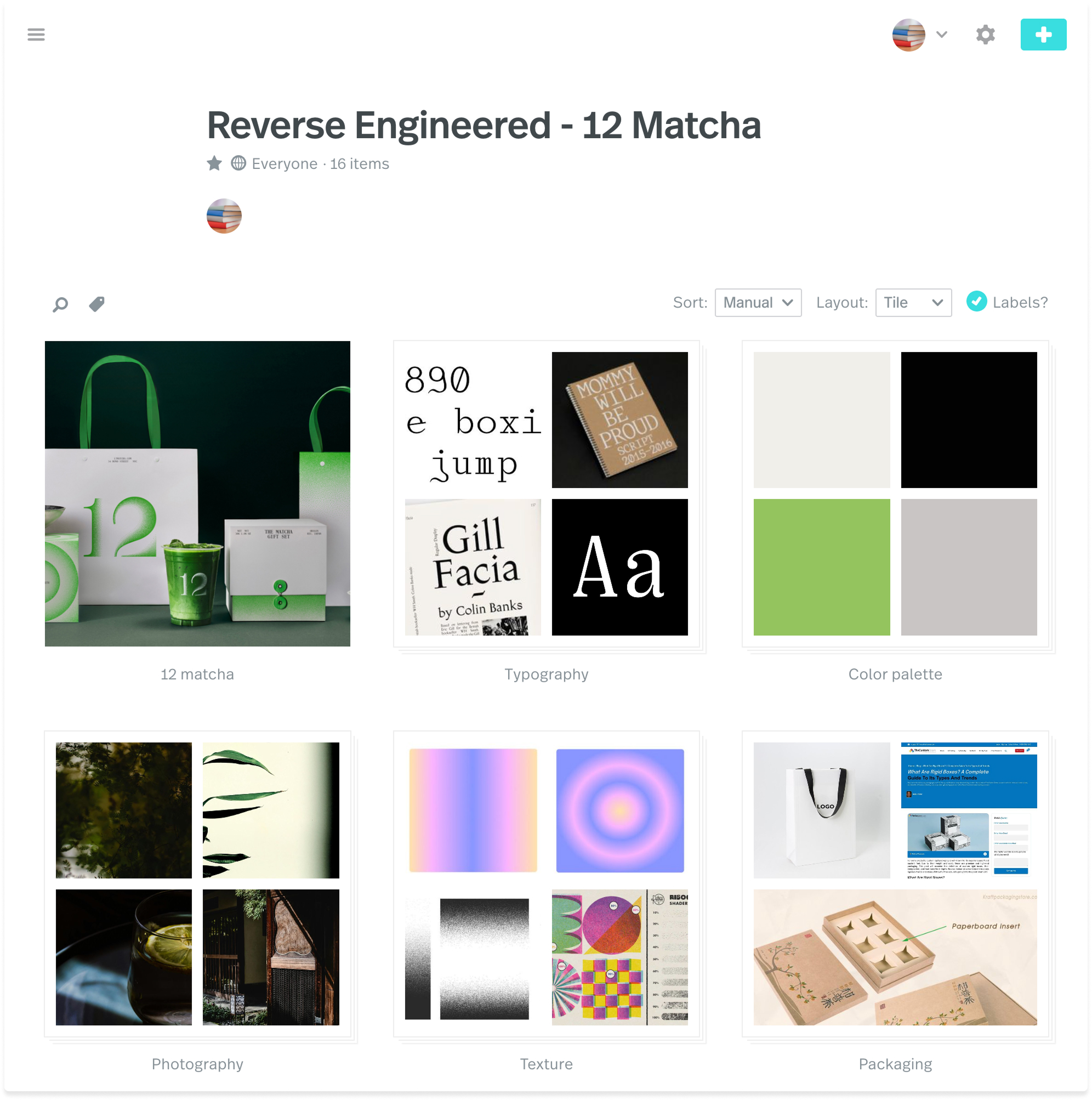
With Dropmark, we reverse-engineered the brand to a moodboard to understand what’s at work here: how typography, color, UI, and symbolism work together to create a system that’s gentle but purposeful.

Here’s how it all comes together:
Color palette
The new palette is vibrant but grounded. A deep navy remains true to the original identity, signifying trust in the brand. It’s now paired with brighter, more energetic shades of blue and pops of coral and cream, bringing a human touch to a space often dominated by institutional coldness. The balance creates a tone of reassurance and compassion, not clinical distance.
Typography
We’re always fans of custom type, and for this project, JKR introduced a custom sans-serif typeface with soft terminals, generous spacing, and rounded corners. The result is compassionate, accessible, and contemporary. It works great across print and digital touchpoints. Strong yet clear and kind, it feels like a key shift for a brand rooted in care.
Symbol
One of the most recognizable updates is the new logo shape. It retains the familiarity of the old logo but strips away the noise—now soft, geometric, and adaptable. It functions as a standalone mark or inline with text, appearing across signage, social media icons, and mobile UI. Flexible across digital, print, and signage, it reinforces brand recall while adding visual charm.
UI decisions
The live RSPCA website embodies the brand’s values through practical and purposeful UI. In contrast to the warmth generated by the typeface and color palette, there are no rounded buttons or exaggerated flourishes here—just solid, accessible interface decisions.
-
Square or slightly radiused buttons
-
High-contrast color pairings for readability
-
Simple top navigation and CTA hierarchy
-
Large, legible text and clean layouts
-
Mobile-friendly without feeling templated
Photography
Photography across the brand avoids stock clichés. Instead, it focuses on candid, in-between moments, animals in safe spaces, and people connecting through care. Line illustrations add playfulness without becoming overwhelming, supporting content rather than distracting from it.
Build your breakdown
We used Dropmark to collect references and dissect how each design choice supports the RSPCA’s mission. You can see our full moodboard here.
Want to try it yourself? Find a brand you admire, start a collection, and break down what’s working—from type choices to layout systems. Reverse engineering is a great way to sharpen your eye, and Dropmark makes it simple to stay organized while you do it.
By breaking down brands into their key elements, we can return to these inspirational collections for future projects (It also doubles as a creative exercise if you feel stuck). This spin on inspiration hunting takes the pressure off of a blank page. It allows you to explore what makes designs resonate with you instead of forcing gold from your pen when the ink feels dry.
We hope you enjoyed this edition of Reverse Engineered. If this type of project inspires you, we hope you make your own! Go take a look at our collection to explore further, or get started on your own! Let us know if you’ve got a suggestion for who we should reverse engineer next!