Reverse Engineered - 12 Matcha
Have you ever seen a brand and thought, I wish I could make something like that? Us too! That’s why we’re peeling back the layers of our favorite brands to uncover what makes them stand out, and using Dropmark to turn them into creative inspiration fuel.
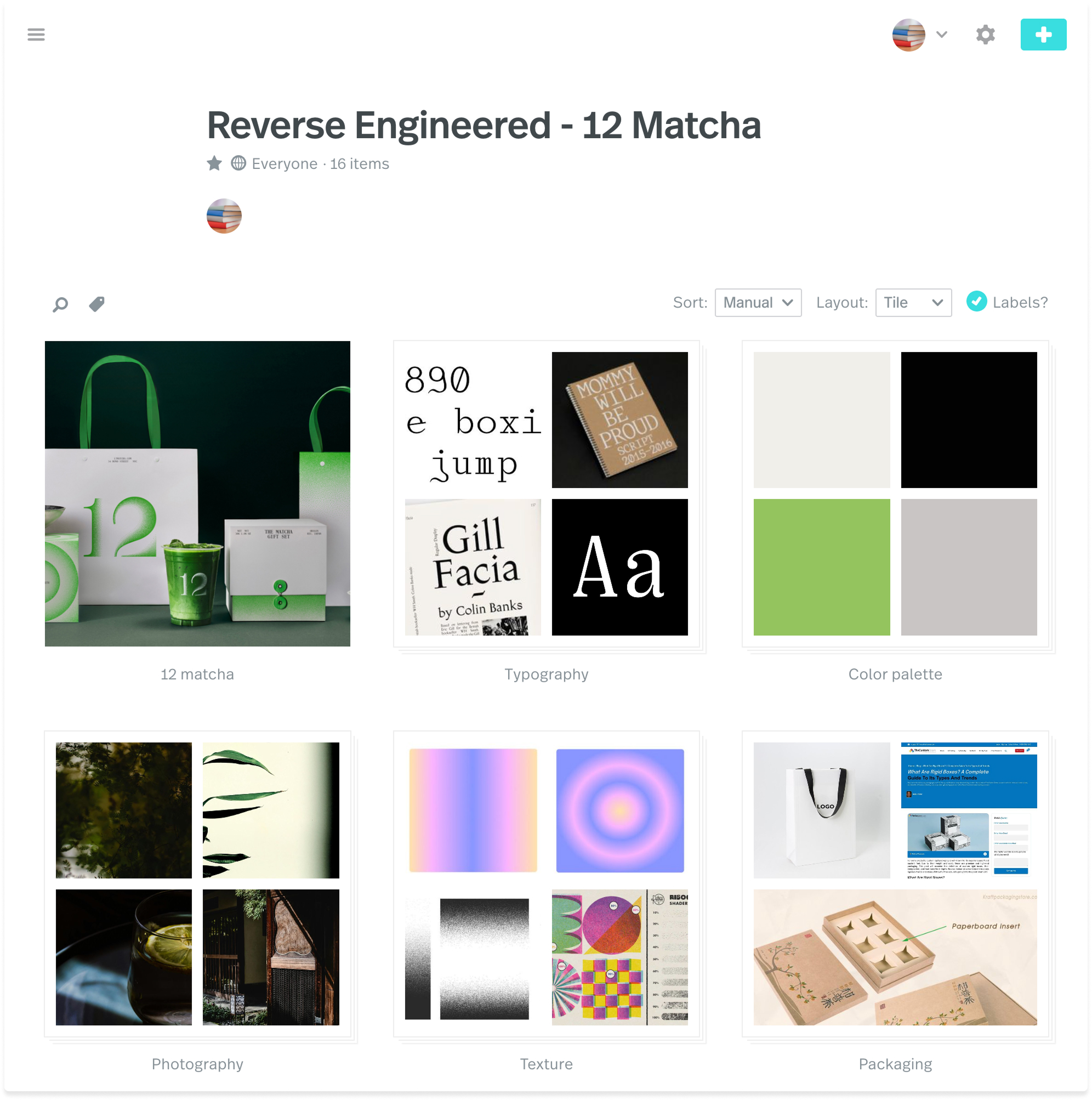
There’s something magical about how Base Design captured the boldness of matcha culture in the branding for 12 Matcha, a high-end take on the ceremonial tea. It’s part fashion label, part ritual, part design playground. We couldn’t resist breaking it down.
With Dropmark, we pieced together a reverse-engineered moodboard to understand what’s at work here: the balance of sharp serif and soft minimalism, the editorial feel mixed with the vivid green that’s as much about the product as it is about power.

Here’s what we noticed:
Color Palette: 12 Matcha’s color story is deceptively simple. The vivid matcha green is the star, used sparingly but powerfully to evoke freshness, energy, and purity. It’s not just a nod to the product, but a declaration of intent. Surrounded by a disciplined palette of tones that give the brand a modern edge, the overall effect is clean but not sterile, elevated without being flashy.
Typography: More often seen in typewriter manuals or academic footnotes than high-end branding, the monospaced serif typeface feels just like the matcha preparation itself: precise, controlled, and intentional. The fixed-width spacing gives everything an orderly, measured rhythm, reinforcing the brand’s tone of ritual and repetition.
Photography: Continuing the balancing act between soft minimalism and strong negative spaces, the photography for 12 Matcha remains impactfully minimal with deep and thoughtful shadows, macro shots, and a shallow depth of field.
Texture: Beyond typography and layout, 12 Matcha’s identity excels through texture in its use of gradients, sometimes animated, that feel meditative. Visually, the gradients have a grainy, tactile texture echoing powdered, creating depth and softness.
Packaging: The brand stays rooted in intentional design, even with packaging. Through the use of partially telescopic boxes printed with the brand’s green gradient and made from strong and rigid materials, 12 matcha brings an elegant and editorial feel to the tradition of matcha.
By breaking down brands into their key elements, we can return to these inspirational collections for future projects (It also doubles as a creative exercise if you feel stuck). This spin on inspiration hunting takes the pressure off of a blank page and allows you to explore what makes designs resonate with you instead of forcing gold from your pen when the ink feels dry.
We hope you enjoyed this edition of Reverse Engineered. If this type of project inspires you, we encourage you to make your own! Simple takeaways are to analyze colors, fonts, and imagery from brands you love and experiment with these elements in your work.
Take a look at our collection to explore further, or get started on your own! Let us know if you’ve got a suggestion for who we should reverse engineer next!